

The way they talk about it makes it sound like they invented the written word, but that notwithstanding the fonts actually look really nice in my opinion.
The way they talk about it makes it sound like they invented the written word, but that notwithstanding the fonts actually look really nice in my opinion.
Reading some marketing blurb about how these fonts are totally like state of the art and will make everything better is different from buying into what it claims, I guess?
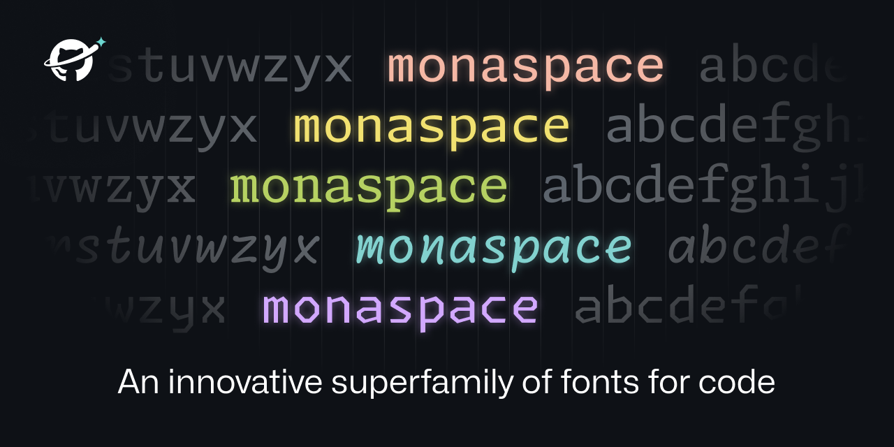
Personally I’m not all that convinced that these’ll be as revolutionary as they make them sound – and Radon is so bad that it makes me question whether the claims about readability and whatnot have any connection to the fonts they published – but I’ll have to give them a whirl anyhow.
Apparently, as ugly as it is, comic sans and similar fonts are supposedly easier to read at a glance than your typical monospace font. I can’t stand it so I don’t use it myself, but some people prefer it due to that.
With Comic Sans I can maybe buy that claim; it was never hard to read, people just think it looks silly (especially in more official contexts.)
At least to me Radon, however, actually is hard to read. I don’t know if it’s my slight dyslexia, but it feels like it’s purposefully doing the opposite of what the fonts like Comic Sans etc. did. It’s not quite Tengwar-bad but it’s still a bit of a jagged easily-confused mess that’s noticeably slower to read